artemfinallymadeit
#Creative
#Brand
Naming and packaging for a new line of horse treats, inspired by the sound of hooves
001
Context
A Czech gummy manufacturer decided to launch a line of horse treats and asked me to come up with the name and design the packaging concept, giving me complete freedom over the idea and how it would look
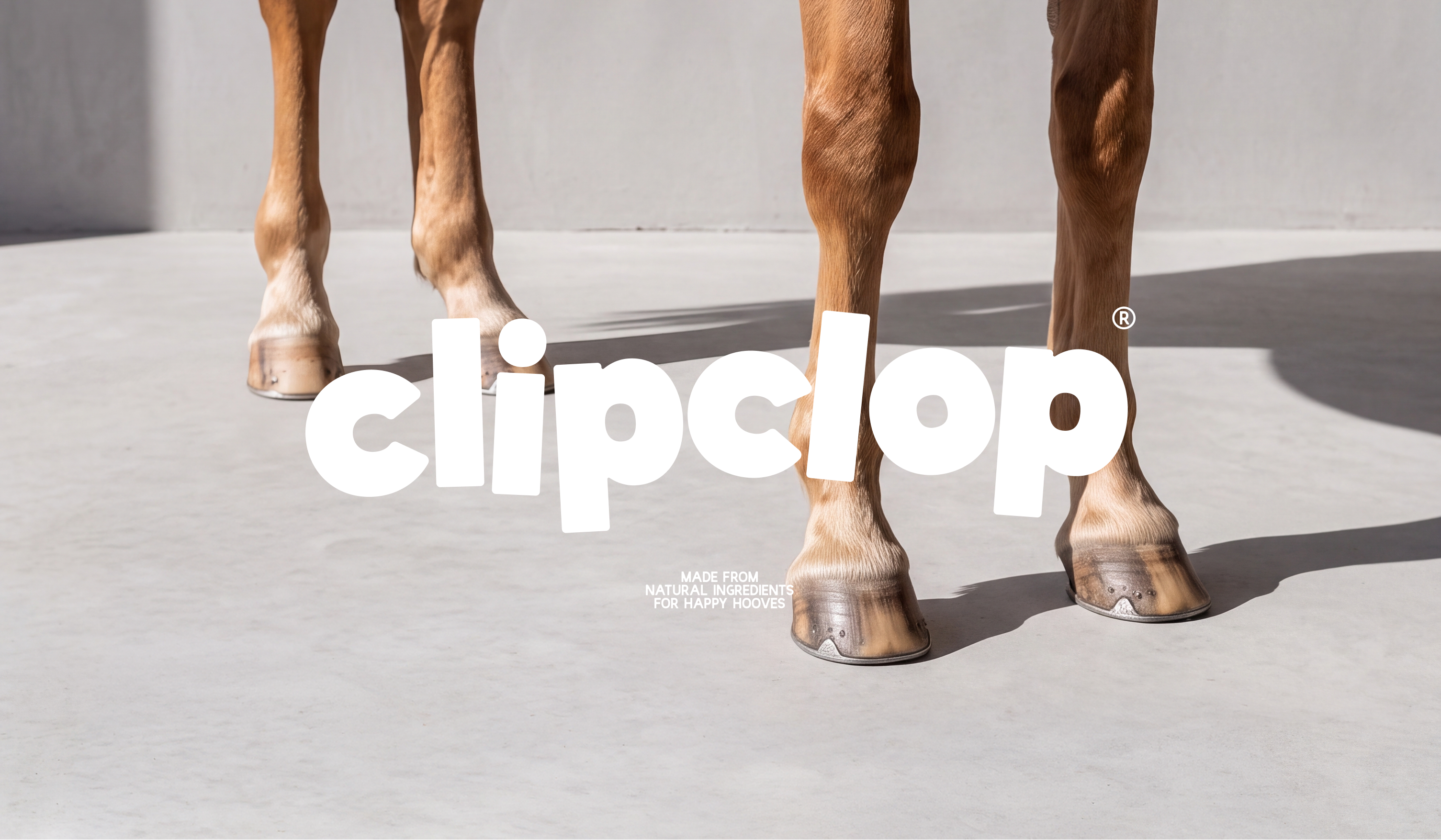
The name took a while. At first, nothing felt right. I didn’t want it to sound too serious or sporty, or turn into another farm-style brand, but I still wanted it to feel connected to horses. Then I came up with Clip Clop — short, a little silly and literally the sound of horse hooves. It felt right
While working on the visual concept, I noticed that the letter C looked like a horse’s hoofprint. Two Cs became the brand mark, and that also led to the phrase Happy Hooves in the product description. The rest of the packaging followed from there: a large logo, a bright color for each flavor and patterns made from the ingredients
The ingredients and all other product information were intentionally placed on the front because the back of the pouch was meant to be transparent, so customers could see what the treats looked like
artemfinallymadeit
#Creative
#Brand
Naming and packaging for a new line of horse treats, inspired by the sound of hooves
001
Context
A Czech gummy manufacturer decided to launch a line of horse treats and asked me to come up with the name and design the packaging concept, giving me complete freedom over the idea and how it would look
The name took a while. At first, nothing felt right. I didn’t want it to sound too serious or sporty, or turn into another farm-style brand, but I still wanted it to feel connected to horses. Then I came up with Clip Clop — short, a little silly and literally the sound of horse hooves. It felt right
While working on the visual concept, I noticed that the letter C looked like a horse’s hoofprint. Two Cs became the brand mark, and that also led to the phrase Happy Hooves in the product description. The rest of the packaging followed from there: a large logo, a bright color for each flavor and patterns made from the ingredients
The ingredients and all other product information were intentionally placed on the front because the back of the pouch was meant to be transparent, so customers could see what the treats looked like
artemfinallymadeit
#Creative
#Brand
Naming and packaging for a new line of horse treats, inspired by the sound of hooves
001
Context
A Czech gummy manufacturer decided to launch a line of horse treats and asked me to come up with the name and design the packaging concept, giving me complete freedom over the idea and how it would look
The name took a while. At first, nothing felt right. I didn’t want it to sound too serious or sporty, or turn into another farm-style brand, but I still wanted it to feel connected to horses. Then I came up with Clip Clop — short, a little silly and literally the sound of horse hooves. It felt right
While working on the visual concept, I noticed that the letter C looked like a horse’s hoofprint. Two Cs became the brand mark, and that also led to the phrase Happy Hooves in the product description. The rest of the packaging followed from there: a large logo, a bright color for each flavor and patterns made from the ingredients
The ingredients and all other product information were intentionally placed on the front because the back of the pouch was meant to be transparent, so customers could see what the treats looked like