artemfinallymadeit
#Mobile
#Product
#UX
#UI
VPN service redesigned from a Telegram bot and an unconventional Mini App into a functional Telegram Mini App and web product under legal constraints
001
Context and problem
Increasing internet restrictions and VPN blocks in Russia have changed the familiar VPN usage flow
Due to increasing internet restrictions in Russia, VPN demand has grown, while the market has become less stable. Services are blocked, VPN advertising is restricted, and many apps have disappeared from the App Store. As a result, the familiar flow “download the app → pay → connect” has changed. Users now have to work with two separate parts:
— a VPN service that provides access configurations— a VPN client where those configurations are imported manually

002
Product history
Telegram bot and rushed Mini App created more friction than clarity
The product started as a Telegram bot. Its interface was unfamiliar to most users, and the number of scams on Telegram made some people wary. Support was overwhelmed with questions about how to install and set up the VPN.
The team later launched a Telegram Mini App to address these issues. The first version was built quickly and used unfamiliar interaction patterns that sometimes made it harder to use than the bot. Setup errors continued, and the volume of support requests barely changed
003
Constraints
The product exists within several major platform limitations that directly influenced the flow architecture and fallback mechanics
1 / 4
Telegram Mini Apps have limited capabilities compared to full mobile applications
2 / 4
Connections rely on external VPN clients
3 / 4
Risk of Telegram being fully blocked and users losing access to their accounts
4 / 4
The web version cannot reliably detect the user’s operating system
004
Goal
To make the setup flow easier to understand to reduce installation-related support requests, make the referral program more visible to support organic growth
005
Competitor Analysis
1 / 3
Complex setup flow
In many services, the connection process felt more like a sequence of technical actions than a guided user flow
2 / 3
Hidden referral program
Referral programs existed in almost every product but were barely integrated into the user journey
3 / 3
Weak subscription management
Subscriptions were often perceived as abstract “access keys” rather than full product entities
006
Setup flow
Support request analysis showed that many issues were caused not by technical failures, but by users missing or misunderstanding required actions. This shifted the design focus to actively guiding users step by step
1 / 2
Turning a technical setup into a simple step-by-step flow
The main setup flow was redesigned into a linear step-by-step scenario. Instead of a sequence of technical actions, users move through a structured flow where each screen is responsible for only one specific action
Impact:
Decrease in setup-related support requestsLower drop-off rate during the setup flowImproved setup clarity based on user testing feedback
2 / 2
Adding intentional friction between setup steps to reduce blind progression and setup errors
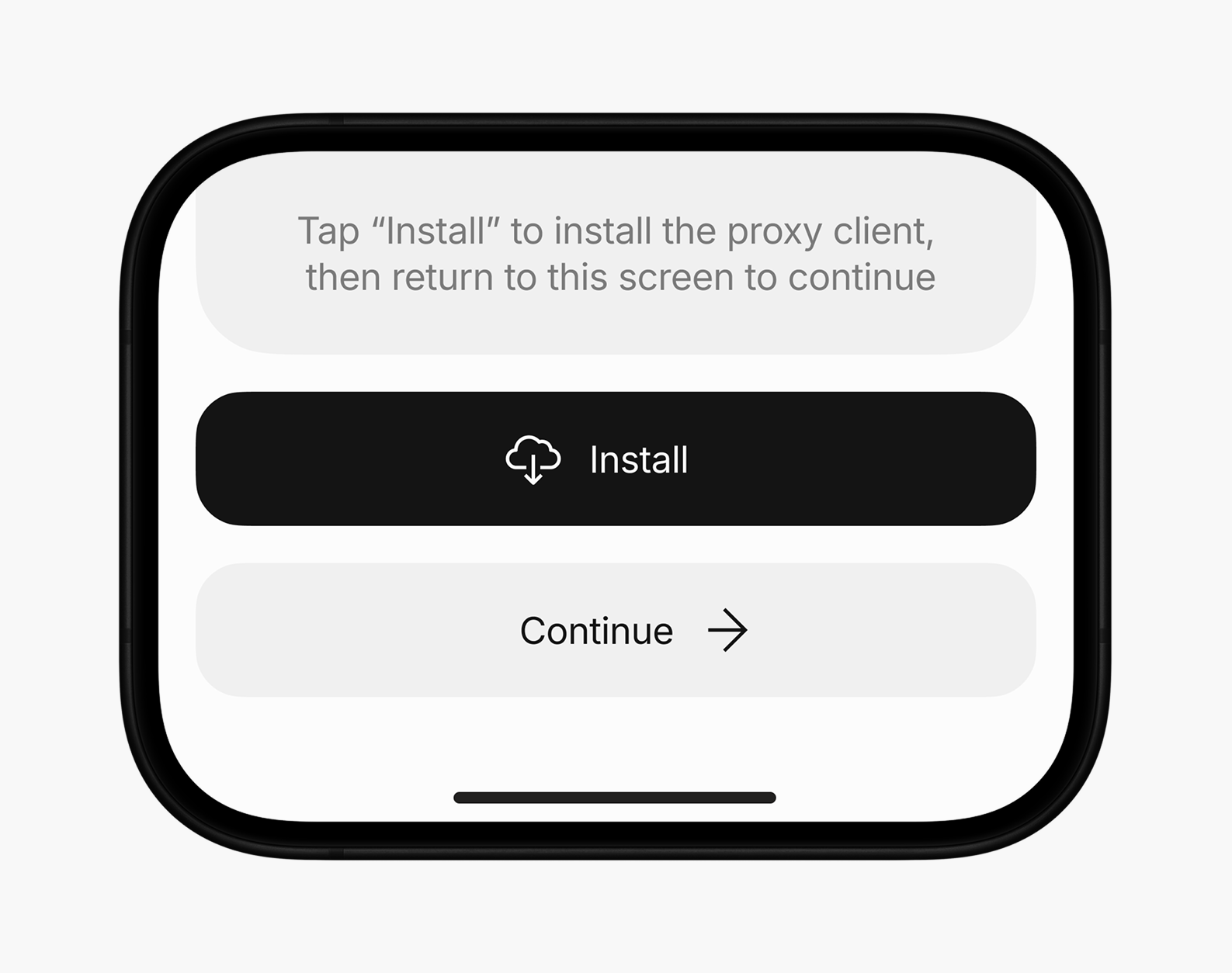
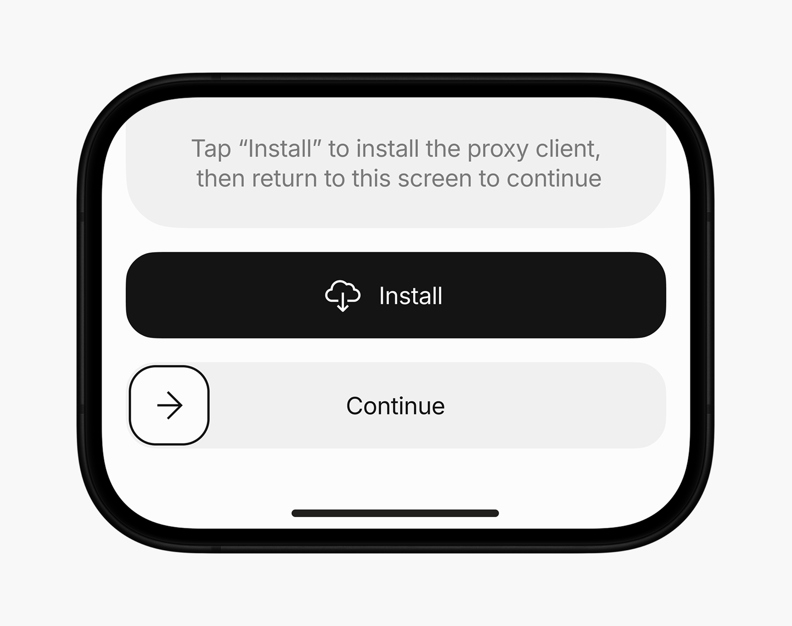
In the first version of the new app, users moved through the setup flow using a standard Continue button. Support requests indicated that many users tapped through the steps without reading the instructions or completing the required actions. To reduce accidental progression, the button was replaced with a Continue slider, adding intentional friction and requiring a more deliberate action before moving to the next step
Expected impact:
Decrease in setup-related support requests
007
Referral program
Introducing the referral program within the first-time subscription purchase flow to naturally familiarize users with the bonus system and its benefits
The referral program was built directly into the subscription plan selection screen. When purchasing a subscription for the first time, users see a preloaded bonus balance and learn about the bonus system before choosing a plan.
Selecting the Use Bonuses checkbox opens a modal explaining how the program works and providing a personal invite link. After closing it, users return to the subscription plan selection screen with the bonuses already applied and the prices updated, making the savings clear before completing the purchase
Impact:
Significant increase in users joining through referral links
008
Subscription management
Transforming subscriptions into full product entities with clear controls, history, and statuses
The home screen was rebuilt around subscription cards. Each card shows key information about a device-specific subscription, while visual cues indicate whether the user needs to take action. Opening a card leads to a detailed screen with any required actions and full subscription details
Impact:
Improved subscription management clarity based on user testing feedback
009
Web version
Reducing platform dependency by bringing the same user flow to the web for existing users
After launching the updated Telegram Mini App, an additional product problem emerged: if users forgot to renew their VPN subscription in time, they could lose access to Telegram itself and, as a result, lose the ability to renew the subscription inside the Mini App. To prevent this lockout scenario, a web version was introduced, allowing users to access their account and manage their subscription outside Telegram. The main UX difference appeared inside the setup flow: the browser could not reliably detect the user’s operating system, so a separate OS selection step was added
010
Access Backup
Making Backup Access visible during and after setup
A prominent button on the final setup screen opens a modal explaining why saving the link matters and provides a personal browser link for accessing the account if Telegram becomes unavailable
After setup, a notification dot in the tab bar draws attention to the Profile section, where users can return to Backup Access, view their bonus balance, and explore the referral program. The bot also sends a message explaining why the link is important and how to save it
011
Outcome
Making the experience clearer helped cut down on failed setups and the support requests they were causing, while integrating the referral program into the first-purchase flow increased participation. At the same time, there is still room for improvement, and the next iterations will be guided by user testing and newly collected data
artemfinallymadeit
#Mobile
#Product
#UX
#UI
VPN service redesigned from a Telegram bot and an unconventional Mini App into a functional Telegram Mini App and web product under legal constraints
001
Context and problem
Increasing internet restrictions and VPN blocks in Russia have changed the familiar VPN usage flow
Due to increasing internet restrictions in Russia, VPN demand has grown, while the market has become less stable. Services are blocked, VPN advertising is restricted, and many apps have disappeared from the App Store. As a result, the familiar flow “download the app → pay → connect” has changed. Users now have to work with two separate parts:
— a VPN service that provides access configurations— a VPN client where those configurations are imported manually
002
Product history
Telegram bot and rushed Mini App created more friction than clarity
The product started as a Telegram bot. Its interface was unfamiliar to most users, and the number of scams on Telegram made some people wary. Support was overwhelmed with questions about how to install and set up the VPN.
The team later launched a Telegram Mini App to address these issues. The first version was built quickly and used unfamiliar interaction patterns that sometimes made it harder to use than the bot. Setup errors continued, and the volume of support requests barely changed
003
Constraints
The product exists within several major platform limitations that directly influenced the flow architecture and fallback mechanics
1 / 4
Telegram Mini Apps have limited capabilities compared to full mobile applications
2 / 4
Connections rely on external VPN clients
3 / 4
Risk of Telegram being fully blocked and users losing access to their accounts
4 / 4
The web version cannot reliably detect the user’s operating system
004
Goal
To make the setup flow easier to understand to reduce installation-related support requests, make the referral program more visible to support organic growth
005
Competitor Analysis
1 / 3
Complex setup flow
In many services, the connection process felt more like a sequence of technical actions than a guided user flow
2 / 3
Hidden referral program
Referral programs existed in almost every product but were barely integrated into the user journey
3 / 3
Weak subscription management
Subscriptions were often perceived as abstract “access keys” rather than full product entities
006
Setup flow
Support request analysis showed that many issues were caused not by technical failures, but by users missing or misunderstanding required actions. This shifted the design focus to actively guiding users step by step
1 / 2
Turning a technical setup into a simple step-by-step flow
The main setup flow was redesigned into a linear step-by-step scenario. Instead of a sequence of technical actions, users move through a structured flow where each screen is responsible for only one specific action
Impact:
Decrease in setup-related support requestsLower drop-off rate during the setup flowImproved setup clarity based on user testing feedback
2 / 2
Adding intentional friction between setup steps to reduce blind progression and setup errors
In the first version of the new app, users moved through the setup flow using a standard Continue button. Support requests indicated that many users tapped through the steps without reading the instructions or completing the required actions. To reduce accidental progression, the button was replaced with a Continue slider, adding intentional friction and requiring a more deliberate action before moving to the next step
Expected impact:
Decrease in setup-related support requests
007
Referral program
Introducing the referral program within the first-time subscription purchase flow to naturally familiarize users with the bonus system and its benefits
The referral program was built directly into the subscription plan selection screen. When purchasing a subscription for the first time, users see a preloaded bonus balance and learn about the bonus system before choosing a plan.
Selecting the Use Bonuses checkbox opens a modal explaining how the program works and providing a personal invite link. After closing it, users return to the subscription plan selection screen with the bonuses already applied and the prices updated, making the savings clear before completing the purchase
Impact:
Significant increase in users joining through referral links
008
Subscription management
Transforming subscriptions into full product entities with clear controls, history, and statuses
The home screen was rebuilt around subscription cards. Each card shows key information about a device-specific subscription, while visual cues indicate whether the user needs to take action. Opening a card leads to a detailed screen with any required actions and full subscription details
Impact:
Improved subscription management clarity based on user testing feedback
009
Web version
Reducing platform dependency by bringing the same user flow to the web for existing users
After launching the updated Telegram Mini App, an additional product problem emerged: if users forgot to renew their VPN subscription in time, they could lose access to Telegram itself and, as a result, lose the ability to renew the subscription inside the Mini App. To prevent this lockout scenario, a web version was introduced, allowing users to access their account and manage their subscription outside Telegram. The main UX difference appeared inside the setup flow: the browser could not reliably detect the user’s operating system, so a separate OS selection step was added
010
Access Backup
Making Backup Access visible during and after setup
A prominent button on the final setup screen opens a modal explaining why saving the link matters and provides a personal browser link for accessing the account if Telegram becomes unavailable
After setup, a notification dot in the tab bar draws attention to the Profile section, where users can return to Backup Access, view their bonus balance, and explore the referral program. The bot also sends a message explaining why the link is important and how to save it
011
Outcome
Making the experience clearer helped cut down on failed setups and the support requests they were causing, while integrating the referral program into the first-purchase flow increased participation. At the same time, there is still room for improvement, and the next iterations will be guided by user testing and newly collected data
artemfinallymadeit
#Mobile
#Product
#UX
#UI
VPN service redesigned from a Telegram bot and an unconventional Mini App into a functional Telegram Mini App and web product under legal constraints
001
Context and problem
Increasing internet restrictions and VPN blocks in Russia have changed the familiar VPN usage flow
Due to increasing internet restrictions in Russia, VPN demand has grown, while the market has become less stable. Services are blocked, VPN advertising is restricted, and many apps have disappeared from the App Store. As a result, the familiar flow “download the app → pay → connect” has changed. Users now have to work with two separate parts:
— a VPN service that provides access configurations— a VPN client where those configurations are imported manually
002
Product history
Telegram bot and rushed Mini App created more friction than clarity
The product started as a Telegram bot. Its interface was unfamiliar to most users, and the number of scams on Telegram made some people wary. Support was overwhelmed with questions about how to install and set up the VPN.
The team later launched a Telegram Mini App to address these issues. The first version was built quickly and used unfamiliar interaction patterns that sometimes made it harder to use than the bot. Setup errors continued, and the volume of support requests barely changed
003
Constraints
The product exists within several major platform limitations that directly influenced the flow architecture and fallback mechanics
1 / 4
Telegram Mini Apps have limited capabilities compared to full mobile applications
2 / 4
Connections rely on external VPN clients
3 / 4
Risk of Telegram being fully blocked and users losing access to their accounts
4 / 4
The web version cannot reliably detect the user’s operating system
004
Goal
To make the setup flow easier to understand to reduce installation-related support requests, make the referral program more visible to support organic growth
005
Competitor Analysis
1 / 3
Complex setup flow
In many services, the connection process felt more like a sequence of technical actions than a guided user flow
2 / 3
Hidden referral program
Referral programs existed in almost every product but were barely integrated into the user journey
3 / 3
Weak subscription management
Subscriptions were often perceived as abstract “access keys” rather than full product entities
006
Setup flow
Support request analysis showed that many issues were caused not by technical failures, but by users missing or misunderstanding required actions. This shifted the design focus to actively guiding users step by step
1 / 2
Turning a technical setup into a simple step-by-step flow
The main setup flow was redesigned into a linear step-by-step scenario. Instead of a sequence of technical actions, users move through a structured flow where each screen is responsible for only one specific action
Impact:
Decrease in setup-related support requestsLower drop-off rate during the setup flowImproved setup clarity based on user testing feedback
2 / 2
Adding intentional friction between setup steps to reduce blind progression and setup errors
In the first version of the new app, users moved through the setup flow using a standard Continue button. Support requests indicated that many users tapped through the steps without reading the instructions or completing the required actions. To reduce accidental progression, the button was replaced with a Continue slider, adding intentional friction and requiring a more deliberate action before moving to the next step
Expected impact:
Decrease in setup-related support requests
007
Referral program
Introducing the referral program within the first-time subscription purchase flow to naturally familiarize users with the bonus system and its benefits
The referral program was built directly into the subscription plan selection screen. When purchasing a subscription for the first time, users see a preloaded bonus balance and learn about the bonus system before choosing a plan.
Selecting the Use Bonuses checkbox opens a modal explaining how the program works and providing a personal invite link. After closing it, users return to the subscription plan selection screen with the bonuses already applied and the prices updated, making the savings clear before completing the purchase
Impact:
Significant increase in users joining through referral links
008
Subscription management
Transforming subscriptions into full product entities with clear controls, history, and statuses
The home screen was rebuilt around subscription cards. Each card shows key information about a device-specific subscription, while visual cues indicate whether the user needs to take action. Opening a card leads to a detailed screen with any required actions and full subscription details
Impact:
Improved subscription management clarity based on user testing feedback
009
Web version
Reducing platform dependency by bringing the same user flow to the web for existing users
After launching the updated Telegram Mini App, an additional product problem emerged: if users forgot to renew their VPN subscription in time, they could lose access to Telegram itself and, as a result, lose the ability to renew the subscription inside the Mini App. To prevent this lockout scenario, a web version was introduced, allowing users to access their account and manage their subscription outside Telegram. The main UX difference appeared inside the setup flow: the browser could not reliably detect the user’s operating system, so a separate OS selection step was added
010
Access Backup
Making Backup Access visible during and after setup
A prominent button on the final setup screen opens a modal explaining why saving the link matters and provides a personal browser link for accessing the account if Telegram becomes unavailable
After setup, a notification dot in the tab bar draws attention to the Profile section, where users can return to Backup Access, view their bonus balance, and explore the referral program. The bot also sends a message explaining why the link is important and how to save it
011
Outcome
Making the experience clearer helped cut down on failed setups and the support requests they were causing, while integrating the referral program into the first-purchase flow increased participation. At the same time, there is still room for improvement, and the next iterations will be guided by user testing and newly collected data